


A mobile AI app built not for a class assignment, not for a hackathon sprint, but for the IDCamp 2025 Developer Challenge: Small Apps for Big Preparedness — something to do during Eid holiday that wasn’t just scrolling.
There is one thing that almost never makes it into disaster coverage. We see the death toll, the rubble photos, the damage estimates — but rarely does anyone talk about the most fundamental bottleneck on the ground: prioritization. Relief teams arrive at the site. There are hundreds of damaged buildings. Which ones have fully collapsed? Which ones are still habitable? Which ones need logistical support first? Right now the process is manual — walking from building to building, assessing with the eye, writing notes on paper or into a spreadsheet.
In an emergency, slow is expensive. Sometimes devastatingly so.
Kizukai — kepedulian, care, in Japanese — was my answer. The idea is straightforward: Photo → AI assesses damage level → Report form fills itself. A relief worker takes a photo of a building, the AI classifies the damage on a scale from DS0 (undamaged) to DS4 (completely destroyed), and the data flows directly into a prioritization system. What used to take tens of minutes per building becomes seconds.
On paper, the idea is clean. The implementation was another thing entirely.
The first attempt started with a level of confidence that, in retrospect, was not entirely earned.
I chose MobileNetV3Small as the backbone. It made sense — lightweight architecture, designed for mobile inference, widely used in edge computing applications. The dataset came from Roboflow: a collection of Hurricane, Tornado, and Earthquake disaster images with clean, pre-existing labels. Training ran. Loss went down. Validation metrics looked reasonable.
Then I tried inference on images outside the training set.
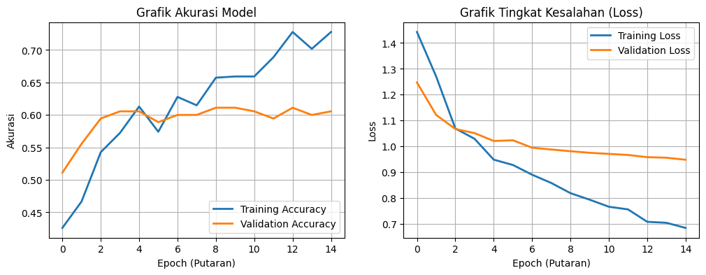
The results were bad. Not “needs fine-tuning” bad — but confidently, randomly bad. The model wasn’t being cautious. This wasn’t underfitting, where a model hedges every prediction. This was textbook overfitting — the model had memorized the answers without learning the concept. It knew the training set cold, and couldn’t generalize to anything beyond it.
The core problem, once examined closely, was one of capacity. MobileNetV3Small simply wasn’t equipped for this task. Detecting building damage is subtle work — wall cracks, structural deformation, a roof that’s partially caved in — all of it requires a richer feature representation than MobileNetV3 can produce. The architecture was too small for the problem.
New strategy: merge three datasets from different sources to get broader global variation.
- TornadoNet Dataset — HuggingFace
- All Hurricane / Tornado / Earthquake — Roboflow
- Building Damage Assessment — Roboflow
The first dataset — around 3,000 images — was almost entirely American-style housing. Not Indonesian. The hope was that adding the second and third datasets, which show more explicit structural damage across a wider range of building types, would give the model the variation it was missing.
It sounds simple: download, merge, train. But the moment I actually opened the files, the reality was different. Dataset A used labels like destroyed, damaged, minor-damage. Dataset B used DS1, DS2, DS3. Dataset C had yet another numeric scheme. These cannot just be concatenated. Forced together without standardization, the model would learn all the wrong things — three different words for the same concept, three different concepts for the same word. Garbage in, garbage out.
The only solution was to re-label everything from scratch, remapping all classes to a single consistent standard: DS0 through DS4.
I installed Label Studio — annotation software I had never touched before. The first few days were just learning the workflow: how to import a dataset, how to define new classes, how to export to YOLO format. After that, the labeling began. One image at a time. Thousands of images. Draw bounding box, assign class, next. Repeat.
There is nothing glamorous about this process. You sit, you click, you draw, you next. But it is the foundation of everything — because a model is only as good as what it’s fed. And if the data is wrong from the start, no architecture can save it.
With a clean dataset ready, it was time to move to a more serious architecture: YOLOv8. Not just for accuracy — YOLOv8 was built from the ground up for object detection, which means it doesn’t just classify an image, it localizes the object within it via bounding boxes. Exactly the right fit for building damage assessment, which needs to know not just what level of damage exists, but where in the image.
Training started. The first few minutes, everything was normal. Then the console started filling up:
ignoring corrupt image/label: cannot identify image file 'train/images/sample_0847.npy'
ignoring corrupt image/label: cannot identify image file 'train/images/aug_frame_112.npy'
ignoring corrupt image/label: cannot identify image file 'train/images/img_0293.jpg'
Dozens of lines. All in red.
I investigated. During the dataset merge, several .npy files — NumPy binary array format — had somehow ended up inside the /images folder. These are not images. They are serialized data arrays stored in a binary format, but their filenames made them invisible among thousands of .jpg files. YOLOv8 tried to open them as image files, and of course failed. Alongside those, several .jpg files were 0 bytes — they had silently failed to download at some earlier point.
I braced for a manual cleanup, and resigned myself to restarting training from zero.
But training didn’t stop.
It kept going. The errors were logged, and then YOLOv8 skipped the corrupt files entirely and continued with the healthy remainder of the dataset. No crash. No abort. The system had a built-in fault tolerance I hadn’t known about — robust enough to survive imperfect data, and honest enough to write a full accounting of everything it skipped to the log.
The final result after training completed?
mAP: 0.72.
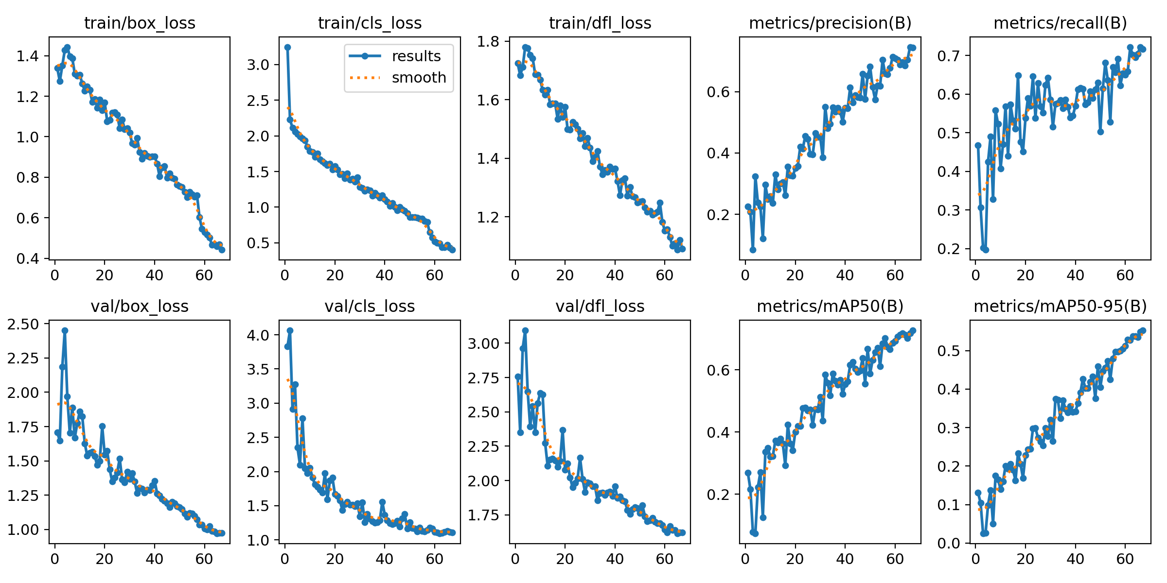
0.72 is a solid number. Not perfect — no building damage detection model is — but consistent and reliable enough to serve as the backbone of a real field tool. And the lesson here goes beyond the metric: a well-designed system can survive dirty data. You don’t need a surgically clean dataset to get a model that works in the real world.
The .pt model was exported to TFLite — the format optimized for mobile inference. Final size: 42MB. Light enough to embed directly into the app, with no dependency on a remote server for every inference call — critical in disaster zones where internet connectivity is often the first casualty.
Integrating everything into React Native was the final chapter. It felt entirely different from everything that came before it. If the data engineering phase was exhausting, grinding work full of dead ends, this part was something any programmer knows well: vibe coding. Connect the MCP servers, prompt the AI, then wait out the generation while doomscrolling Facebook.
The UI was built on Material Design 3 — a design system that gives users a sense of familiarity and safety. Both matter enormously in an app used under pressure, in the field, possibly by someone who has never used a tool like this before. Colors, typography, components — all of it grounded in a system that’s already been tested in production at scale.
The final Kizukai workflow is straightforward:
- Photo — Relief worker photographs the affected building
- AI Detection — TFLite model runs on-device, classifies damage level DS0–DS4
- Form Autocomplete — Detection results automatically populate the report fields
- Submit Report — Data enters the logistical prioritization system
Kizukai is not a replacement for a structural engineer who can calculate axial loads on-site. A mAP of 0.72 is an honest number — there is a margin of error, and in the context of disaster response, errors have real consequences. This is an assist tool, not a final authority.
But the pipeline is real. Photo to structured report, with on-device inference, with a UI operable under significant stress.
And underneath all of it is a lesson more important than the mAP score itself: the boring data engineering work isn’t a side task in an AI project — it is the project. Days in Label Studio drawing bounding boxes one by one, tracing why a .npy file ended up in an image folder, validating mislabeled classes — that is what determines whether the model works or not.
Kepedulian — care — starts with being willing to do the tedious work first.
Down to the data level.
That is Kizukai.